
A core redesign that grew premium conversion
Product strategy and design leadership for Life360's mobile experience, making location sharing, family coordination, and safety features easier to understand and adopt.
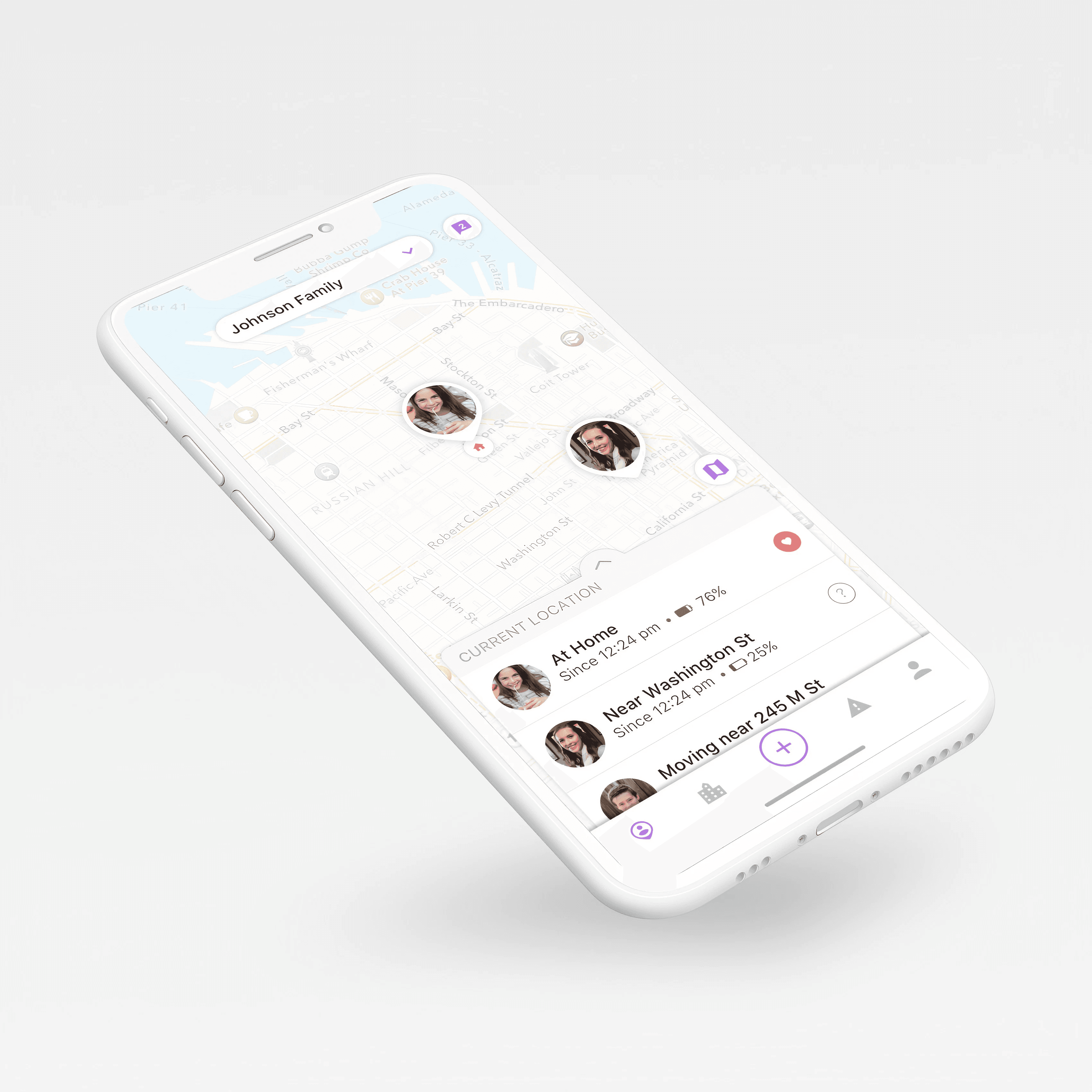
Design
Led the design of a family-safety product used by families at global scale — trust-sensitive, high-stakes, everyday mobile.
Lifted premium conversion 22% by making premium value show up in moments of need — a design decision tied directly to revenue.
Introduced a reusable design foundation so new safety and premium features could ship without UI fragmentation across iOS and Android.
Life360 needed to make family safety feel immediate, useful, and trustworthy across everyday mobile moments.
As Head of Design, I led UX strategy, product design, prototyping, and cross-functional planning for the iOS and Android redesign. The work focused on onboarding, family setup, navigation, location sharing, safety zones, premium conversion, and a more scalable design foundation.
The product served families around the world, so the experience had to reduce uncertainty fast: where is my family, are they safe, and what can I do next?
Customer support themes, app-store reviews, analytics, interviews, and usability testing pointed to a connected set of issues.
- Setup and family invitations created early friction.
- Navigation hid core safety features and weakened repeat use.
- Privacy and location-sharing controls needed clearer mental models.
- Hard-coded UI patterns made the product harder to scale across features and platforms.
I aligned product, engineering, marketing, and executive stakeholders around a simpler product model: make the circle understandable, make safety actions visible, and make premium value show up in moments of need.
Clarify the circle
Reduced onboarding friction and made family setup, invitations, and member states easier to complete.
Prioritize safety actions
Elevated location, safety zones, driving signals, and emergency support into a clearer navigation system.
Build for scale
Introduced reusable patterns so new safety and premium features could ship with less UI fragmentation.
The bet I made was that clarity, not more features, would move the business: simplify the core loop — understand the circle, surface safety actions, and show premium value in the moment of need — and let conversion follow. I led UX strategy and the iOS and Android redesign across product, engineering, and marketing, and aligned executives around that simpler model. It also broadened my range beyond healthcare into trust-sensitive consumer product at scale.
Mobile product leadership
Directed iOS and Android redesign work across core family-safety workflows.
Growth connection
Tied product clarity to a measurable business result — premium conversion.
Cross-functional execution
Aligned product, engineering, marketing, and executive stakeholders around a simpler core loop.
Mobile product redesign
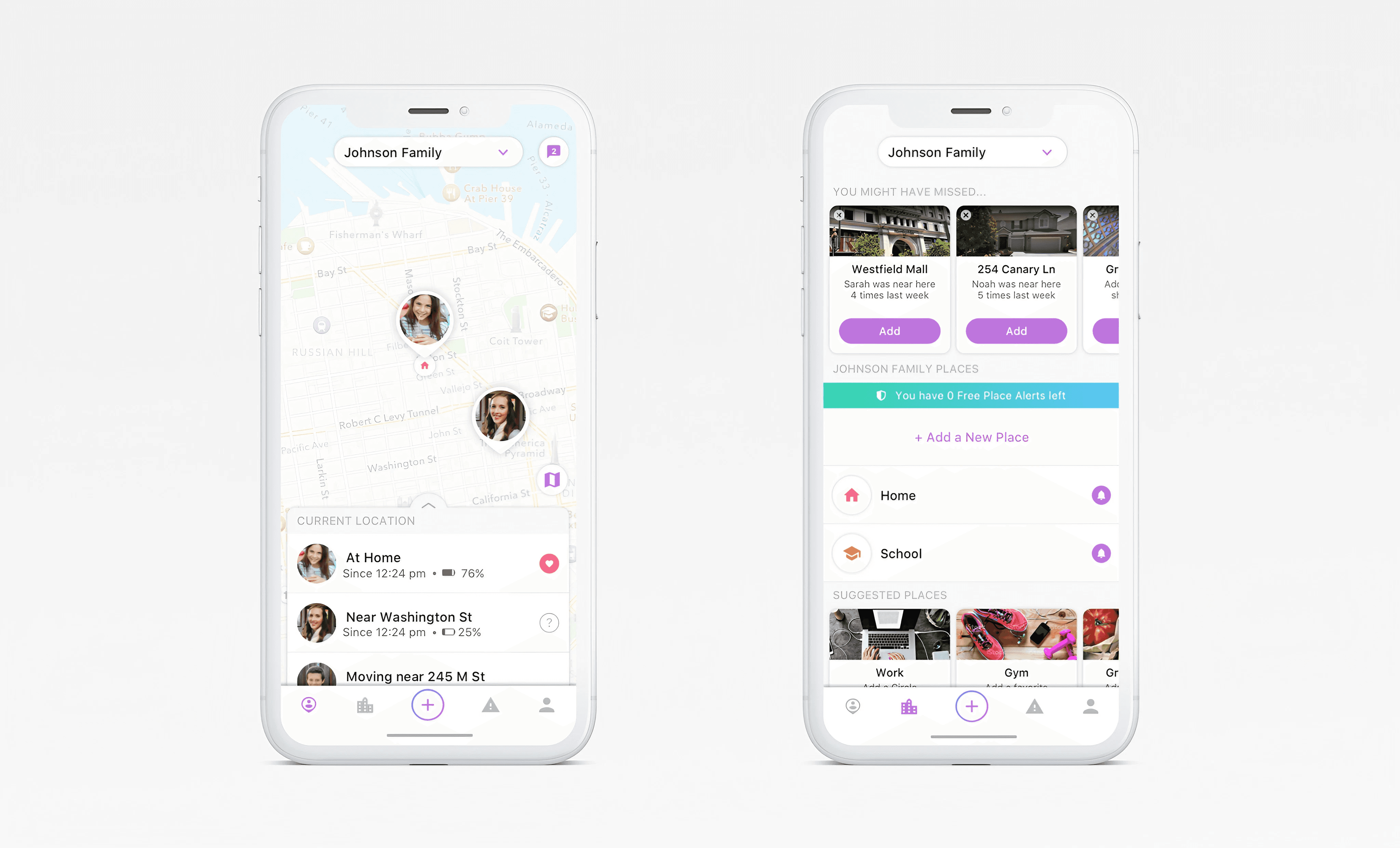
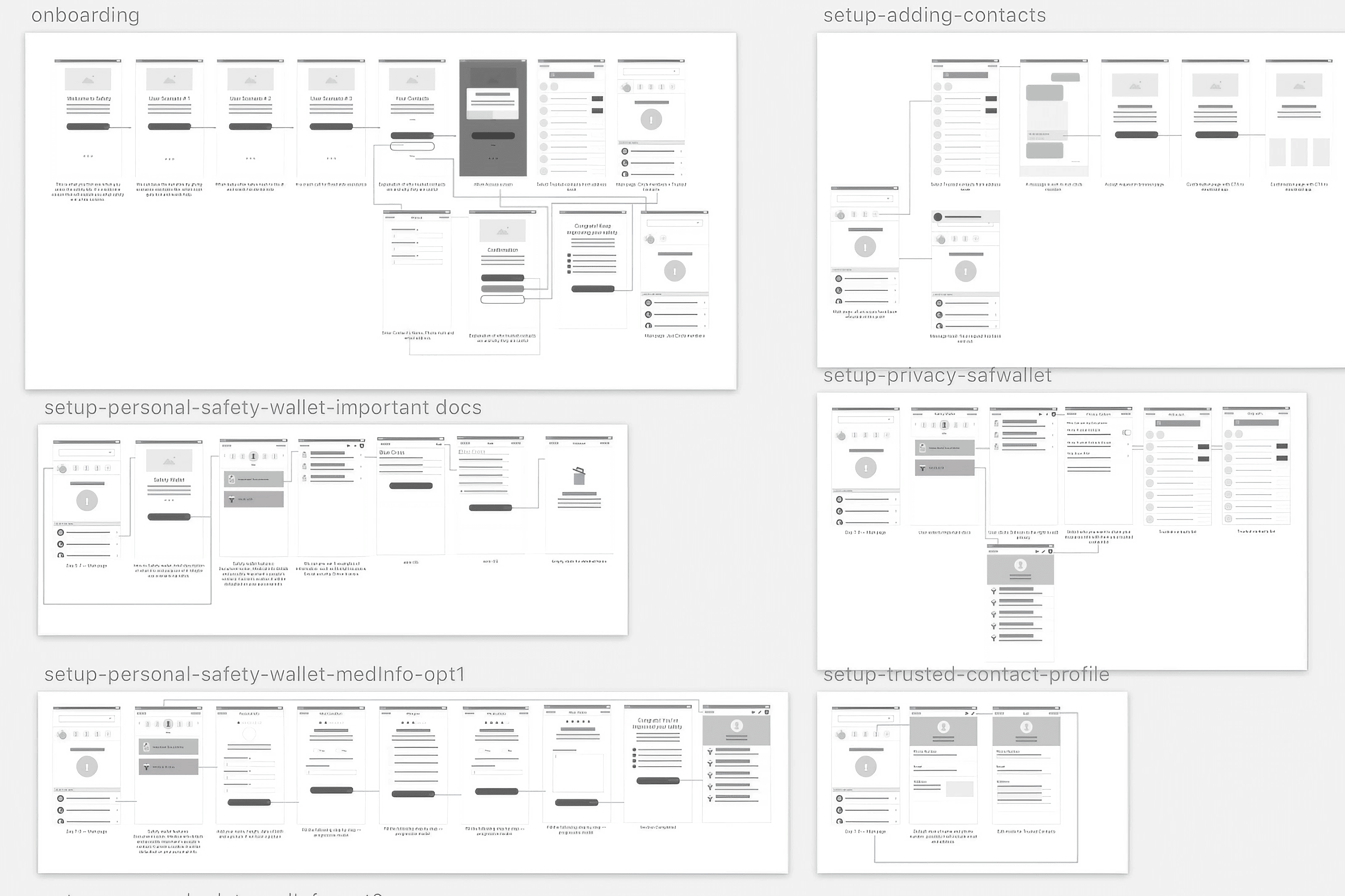
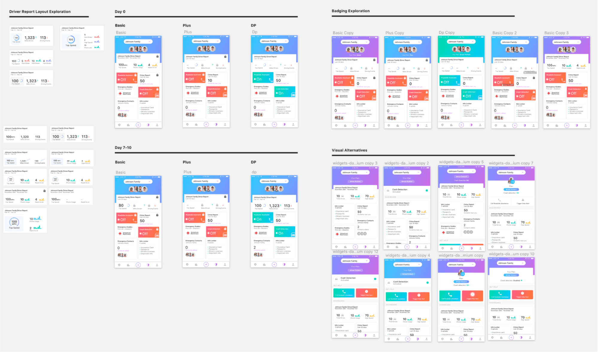
The redesign made safety easier to understand before users had to think about software.
A clearer core loop
Simpler onboarding and a clearer core loop made the family-safety experience easier to understand and adopt across iOS and Android.
+22% premium conversion
Premium value showed up in moments of need rather than isolated from the user's safety needs — converting more families to paid.
A reusable design foundation
Ended the UI fragmentation that slowed every release, so new safety and premium features could ship consistently across iOS and Android.